A tricky responsive entity form in PowerApps Portal
Help UKRAINE
 ! Your action matters! Donate
to support Ukrainian Army! Donate to charity funds!
Organize/join street protests in your city to support Ukraine and condemn Russian aggression!
Expose and report Russian disinformation! #StandWithUkraine
! Your action matters! Donate
to support Ukrainian Army! Donate to charity funds!
Organize/join street protests in your city to support Ukraine and condemn Russian aggression!
Expose and report Russian disinformation! #StandWithUkraine Introduction
We are living in a time where most consumption is happening on mobile platforms. That’s why modern websites should definitely have a responsive approach - the ability to scale to any possible screen resolution. In most websites, developers need to spend a good amount of time making them responsive. Wide varieties of front-end libraries and frameworks help them to make it easy. In the Power Apps Portal Microsoft uses Bootstrap as their library of choice (however it is version 3.3.X which is a bit outdated, to say the least). When you use predefined templates from MS it is responsive by default right? Almost.
Problem
The problem might occur when we try to use entity forms. Let’s create a simple form in a Starter Portal - it will consist of a Summary tab that will be formatted as two columns. Let’s add two section - one for contact details and second with some additional info. You can see the result on the screenshot below.
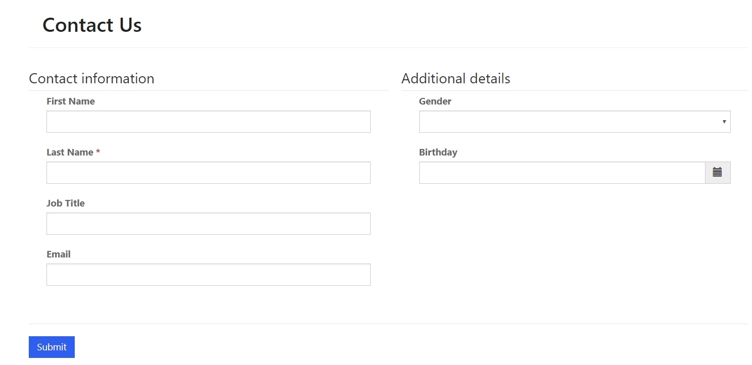
On the big screen, everything looks great. Now we will switch to the mobile version.
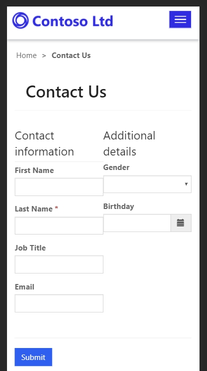
As you might see it squeezed the form instead of reflowing fields like when you have a tab with only one column width. So what happened? Let’s take a more deep dive into how exactly Portal renders forms and their styling.
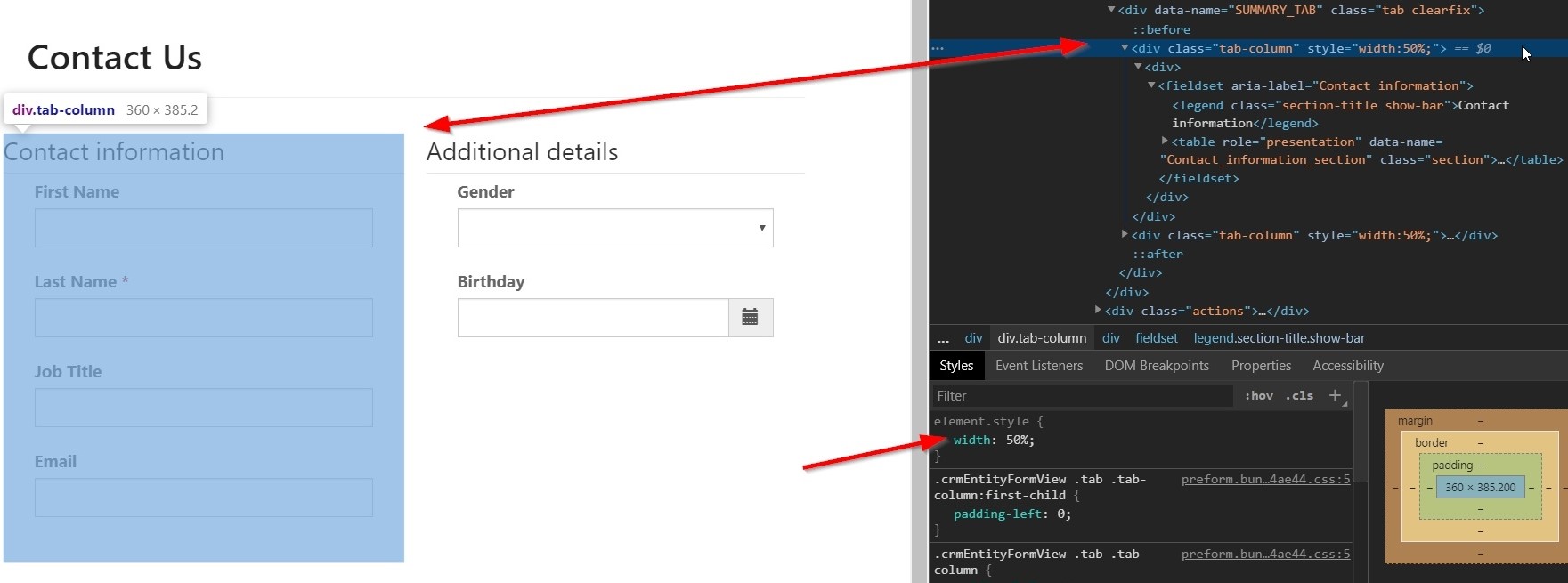
How Portal render entity form
When an entity or web form is rendered Portal creates a separate div for each tab, then separate div for each column in a tab and then div which will contain fieldset tag with fields inside the table tag. The problem occurs on the div for the tab column. Portal adds property that set the width in percentage depending on a number of columns. In our case, it sets width to 50% (see picture below). Because of this, it will squeeze form on mobile.
So if you want to create a mobile-friendly experience you need to create a form that will have only one column and then play with columns in sections right? Well that would be the easiest solution. But what if you need to have a tab with multiple columns? Some CSS might help here.
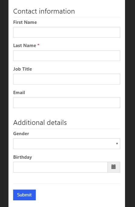
Each column has a class called tab-column. Unfortunately, Portal is not setting width using this class, instead, Portal will set it directly on a div. However, we can still use this class to easily update mobile behaviour. All you need is add next CSS to your page styles:
@media only screen and (max-width: 600px) {
  .tab-column {
    width: 100% !important;
  }
}
What this CSS rule will do is make the width of columns 100% on devices where the screen is less than 600px. You can modify it to fit your needs. See result below.
Conclusion
Power Apps Portals is a really powerful tool to easily create a website to expose data from your CDS instance. Despite being responsive in a lot of scenarios, sometimes you need to add some CSS to make your Power Apps Portal page truly responsive. Hope you find this article useful.